
Build Your Own Coloured Map in Python (3 Easy Steps)
pandas datareader + plotly is a powerful combination

Dear readers, in this week’s post, we will go a bit technical and walk through some steps to create a choropleth map.
What is a choropleth map, you may ask?
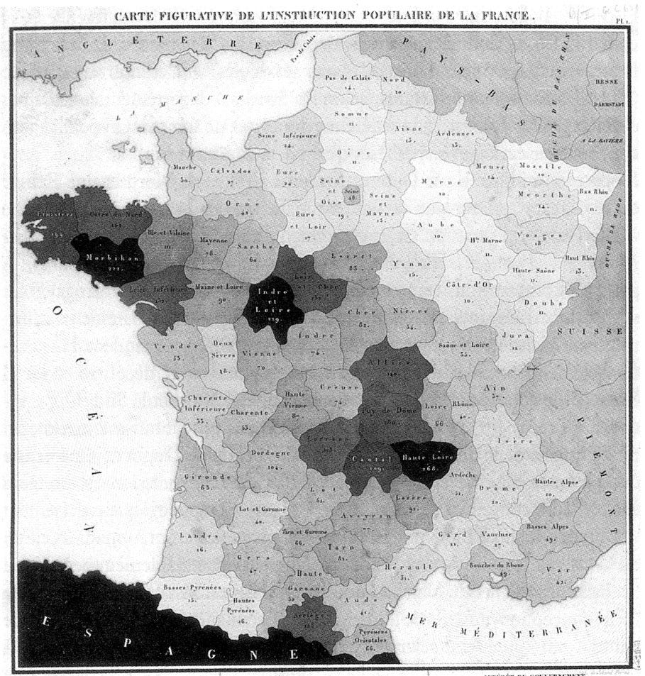
Well, as a picture paints a thousand words, let me show you the earliest known choropleth map below. Created in 1826 by Baron Pierre Charles Dupin, this choropleth map depicts the availability of basic education in France. More ‘cartes teintees’ (‘tinted maps’) were soon produced to visualise other statistics.
In this post, my goal is to show you how easy it is to use Python to code your own choroplet depicting sustainability-related statistics, for instance visualising the use of renewable energy by country.
I know we are in the golden age of AI/low-code/no-code/vibe-code (hate that term by the way) so you may be thinking: why do we still need to learn how to code? To that my counter is that it’s fun and therefore, why should we let AI have all the fun?
Call me old school but I think it is inherently satisfying to see the output of your own code (that is not AI generated). In a world where everything and anything is generated by AI, I believe there is still some value in writing code by hand (i.e. not by prompt).
With the ranting out of the way, let’s walk through the steps to build your very own choropleth. By the end of this, I hope you will agree with me that:
Writing code is not that intimidating and it’s actually fun
We can start really simple by removing the usual friction of coding (such as installing packages/figuring out which environment to use)
To implement point No. 2, we will utilise these tools and packages: Google Colab, pandas_datareader and plotly
Let’s begin!
Step 1: Fire up Google Colab
Type in ‘Google Colab’ in your Google search box and click on the first link to open up the Google Colab page. For the uninitiated, Google Colab is “a hosted Jupyter Notebook service that requires no setup to use”. A Jupyter Notebook, in turn, is an interactive Python environment, which we will use to generate the choropleth map. Trust me, it will be easier when you follow along!
With that, you are 33% closer to the finishing line.
Step 2: Type in the following
Just like how an apprentice may learn by copying the master, I find typing code manually to be a great way to understand and learn what is going on.
Before proceeding further, a disclaimer here: my inspiration for this post came from Chapter 5 of the excellent book on Python Dash by Adam Schroeder, Christian Mayer, and Ann Marie Ward.

The writers hosted their code for the book on GitHub and since one of the best ways to learn is to read others’ code, this is what we will be doing. Specifically, we are interested in the part where it reads data from the World Bank and generates a beautiful map. This book also incorporated steps to build very cool interactive dashboards so be sure to check that out if you are interested.
For the purpose of this post, let’s just focus on extracting the data and building the map.
For this step, let’s type in/copy from Github the following code into your Google Colab.
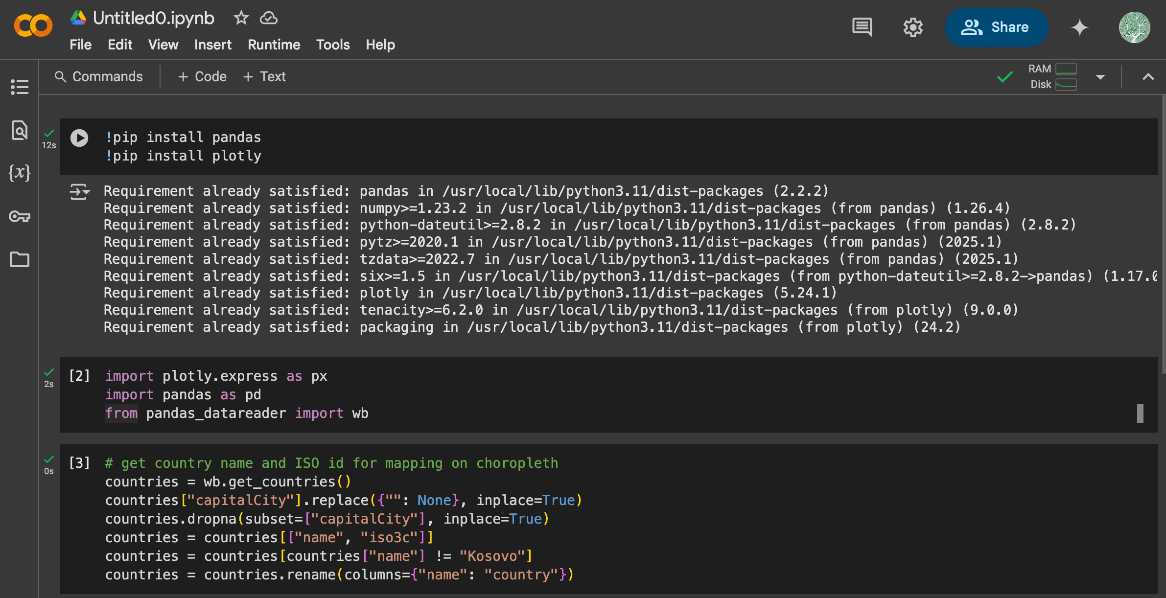
Here I will quickly run through what we just did: in the first cell we installed the required packages: pandas and plotly in the first cell and press play (or Shift + Enter) to run the code. In the second cell we imported them so we could use them later. The third cell is simply some data cleaning (what the authors of the Dash book did) to get the country names for mapping so we can extract the data. For now, you can just follow along and this will make more sense later.
Step 3: Experiment and have fun!
With the basic set-up out of the way, in the last step we will be extracting data and generating our choropleth map.
Since we are extracting data from the World Bank, this website will be your handy guide where you can search for the data point that you need.
For instance, for this post we will be mapping Electricity production from renewable sources in kWh by country. A simple search on the World Bank guide page (linked above) will bring us to this specific page, which provides more details on the data point. Why this is important is that we will be using the ID of this datapoint (in the indicators entry in cell 4 below) to extract the data.
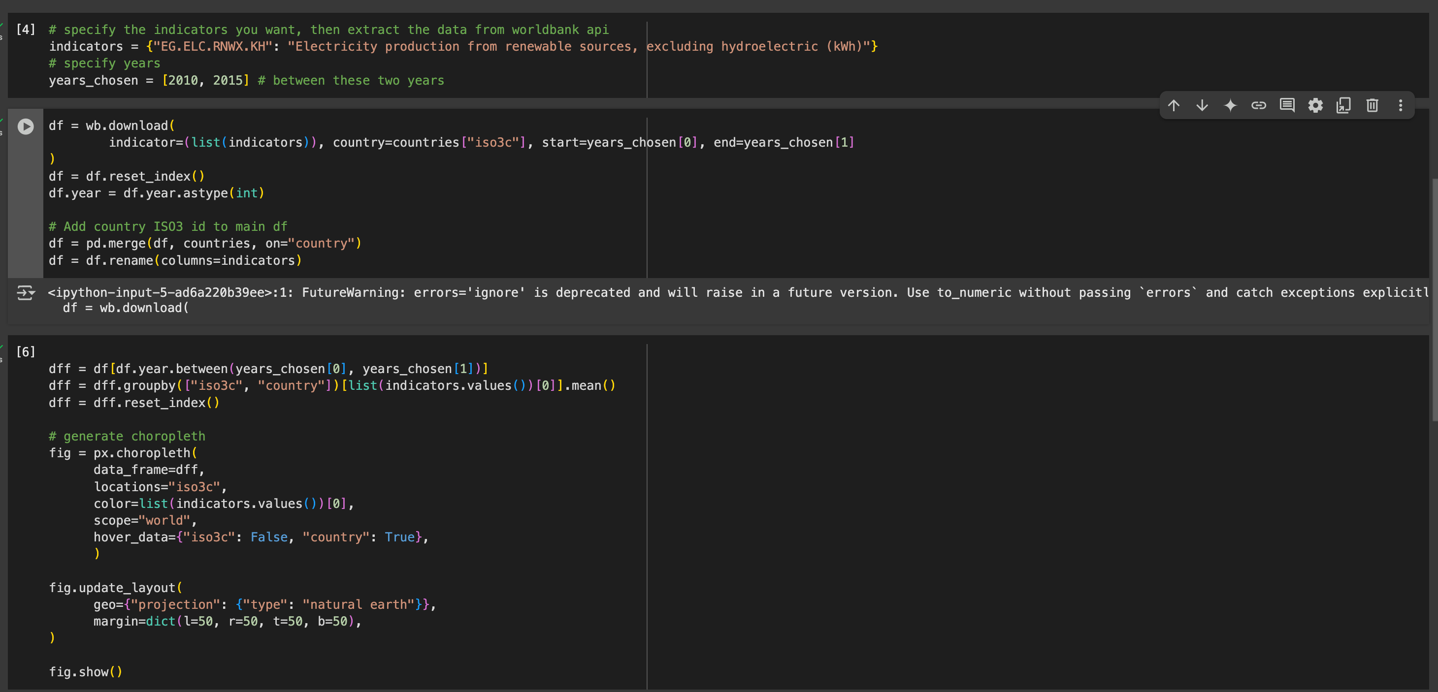
As you can see in the cell marked [4], the indicator that we chose (“EG.ELC.RNWX.KH”) corresponds to the data point “Electricity production from renewable sources, excluding hydroelectric (kWh)” and we specified the range of years (2010 - 2015). Unfortunately, the data from World Bank is quite outdated so 2015 is the latest that they have for this data point (again, check the specific guide page for data availability).
Cell 5 is where the magic of pandas_datareader happens. We specified the indicator that we wanted, along with the country codes generated in step 21, to get the data in a dataframe.
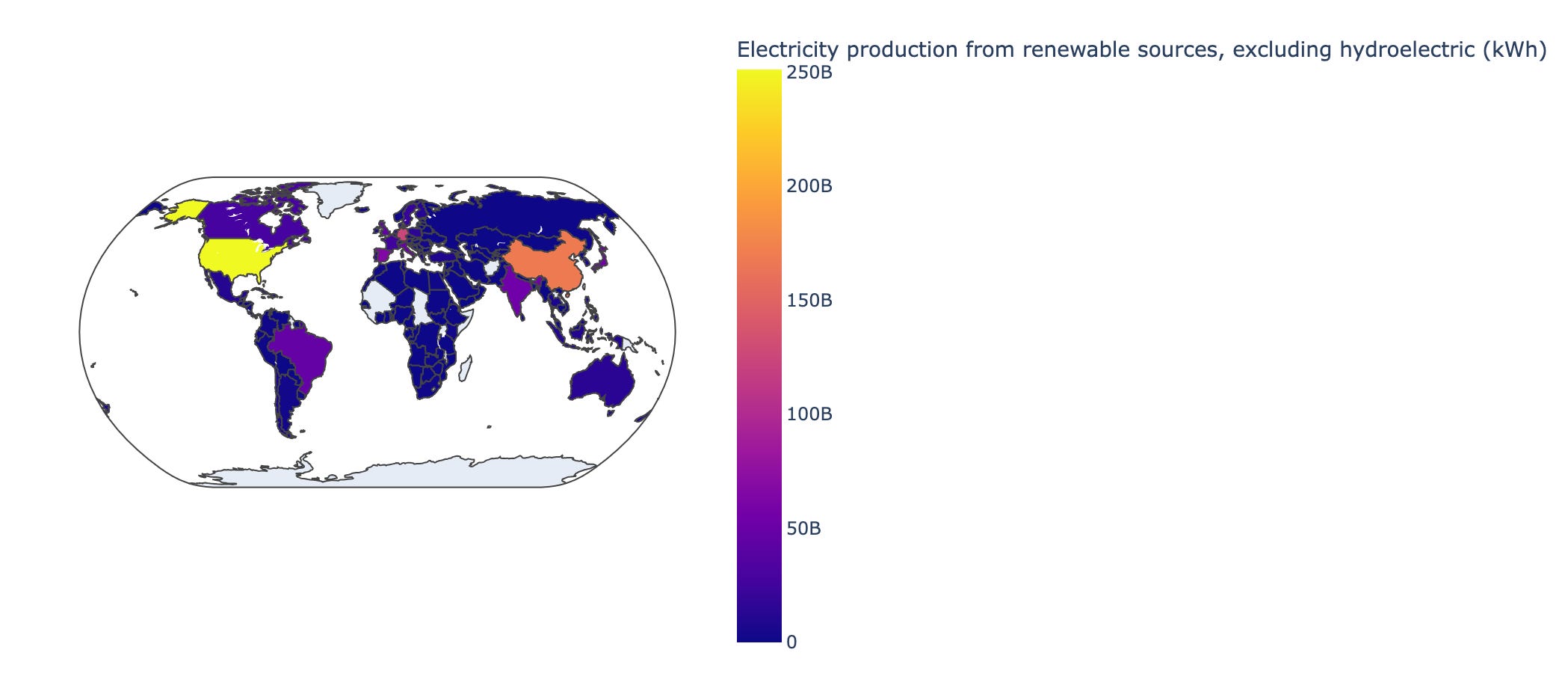
With the data from the dataframe, in cell 6 we calculated the mean value for the data point for each country over these years and finally use plotly to generate the choropleth map below:
And that’s it!
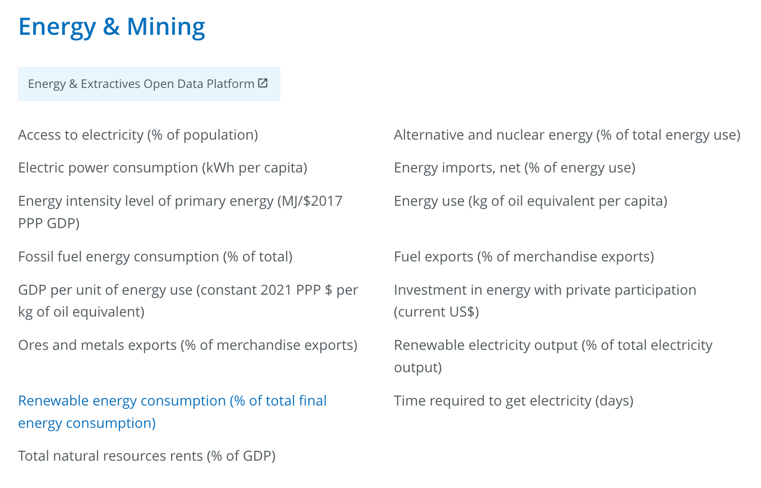
If you are following along so far, you can experiment with the different indicators related to the climate change/environment/energy from the World Bank. A snapshot below:
All you have to do is to change the indicator, the corresponding name and years in cell [4] and to re-run the cells to generate the desired map.
For instance, this map below is for Agricultural land (sq. km) from 2015 to 2020:
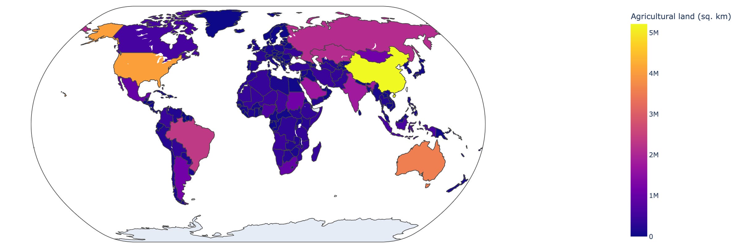
My key take-away from this notebook is that it really doesn’t take a lot to start and pandas_datareader made it really easy to extract data from sources such as the World Bank. With a powerful graphing tool like plotly, one can then visualise the data with a choropleth map such as the above, where we can see that the US and China are both world leaders in electricity production using renewable sources.
The Jupyter notebook for this post is hosted here if you want to experiment with it. Have fun and as always, feel free to reach out with any comments or queries!
The authors of the Dash book used a clever hack to remove country names without capital so that we get all countries in return. They also remove Kosovo as the datapoint has some issues in the past.