
A Gentle Introduction to Geospatial Analysis with Python
Step-by-step guide to plot sea ice extent data from the National Snow and Ice Data Center

Analyzing geospatial data is a key component in quantifying sustainability. It is a useful analytic tool to observe geographic patterns, visualize changes and derive insights via spatial relationships.
In this post, we will show you how to download the sea ice index data from the National Snow and Ice Data Center (NSIDC) and create an animation that tracks the year-on-year changes.
All the code is in this Jupyter Notebook, so feel free to follow along with this post.
Let’s begin!

Why geopandas
We will be using the geopandas package from Python as it is easy to get started without the need for a spatial database such as PostGIS.
If you are familiar with the pandas package in Python, you can think of geopandas as an extension that combines the capabilities of pandas and shapely, a Python library for geometric operations and manipulations on geometric objects.
Downloading the data
The NSIDC has a wealth of data on sea ice extent, growth and concentration and is a great place to get started. Its database is well catalogued and has a easy search function to find the data that you need.
We will look at its Sea Ice Index, which “provides a quick look at Arctic- and Antarctic-wide changes in sea ice”.
Scrolling down to Data Access & Tools, and you will see the HTTPS File System below:

You can click on the Access Guide to read more about getting the data either using a command line utility like WGET, or via Python or R. This HTTPS File System replaces the old FTP file system to extract data from the website.
Clicking on the green Get Data button will bring you to the Index file. For our analysis, we will just look at the North region’s shapefiles. Following the file path you would arrive at a page that looks like this:
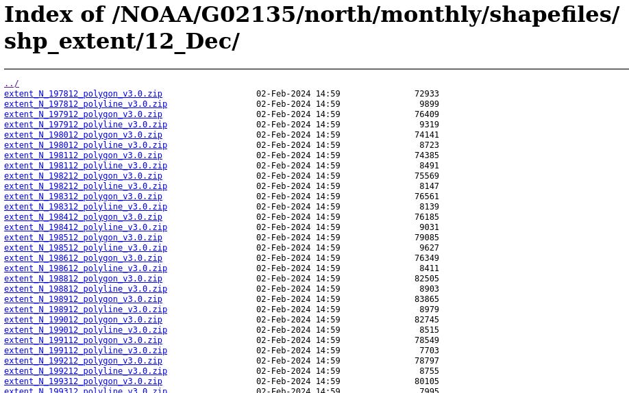
You could click on each file individually to download and unzip the file, but over here at QESG, we will show you a way to automatically download all the files you need and unzip them directly.
Starting with polyline1 files, the code snippet below will do the trick using requests, BeautifulSoup and zipfile:

You need to specify your own extract path for the location to save these unzipped files.
Plotting using geopandas
Once you downloaded and unzipped the files, you can see there are a few different file types:

For our purpose, we only need shapelist files, so we can only need to identify files that end with .shp, which we assign to the variable shapefile_list.
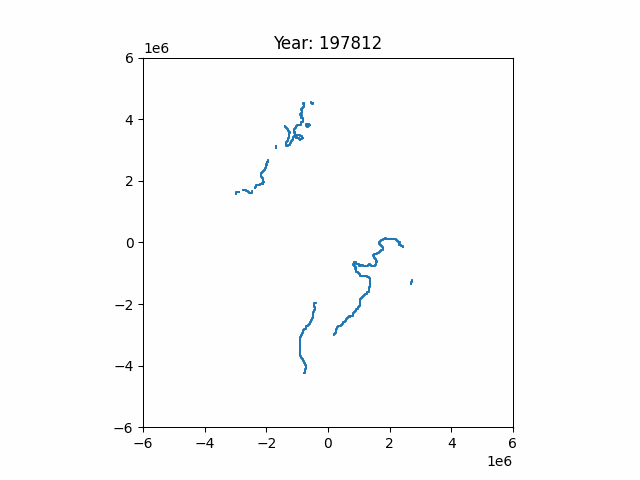
We could plot the first shapefile from the shapefile list, which represents one of the years of the data. Looking at the files, they represent the sea ice extent data in December from 1978 to 2023.

You can see that the plotting is fairly straightforward. Once you read the shapefile into a geopandas (gpd) object, we can call its plot method. The blue line represents the sea ice extent — the boundary measuring the area of ocean covered by sea ice — for the particular year.
Creating an Animation
Given that we have a series of data from 1978 to 2023, can we create an animation to track the change in sea ice extent? Yes, of course!
The code snippet below handles the sorting of the shapefiles according to year and month, and then plotting the charts.

You can then save the animation as a gif file, which looks like this:
Pretty neat — but just looking at the lines alone may not be sufficient. We can repeat the same steps above, but now instead of just polylines, we plot the polygons instead.
The elegant thing about geopandas is that the steps required to plot a polygon or a polyline are exactly the same — you just need to specify the .shp filepath and plot will handle the rest.
Here is the resulting polygon:

Much clearer isn’t it?
Comparing the first point of data (Dec 1978) and last point of data (Dec 2023), can you notice the differences
in sea ice extent?


One obvious difference would be the area in 2023 seems to be smaller than 1978. Having the charts side-by-side makes comparing these a lot easier.
Summary
This post is a gentle introduction to the world of geospatial analysis, which is a useful tool to have in quantifying sustainability. There are a lot of useful learning resources out there such as this one on Kaggle and this one from DataCamp.
I hope to cover more useful techniques and resources on this topic, so feel free to let me know if there is any particular area that you find interesting or if you have any useful tip that you would like to share.
Once again, if you are interested to follow along the steps, head over to this GitHub link for the full Python notebook.
Polyline is an outline of a shape whereas polygon is the filled shape.