


Learning about carbon risk and a network approach
This week we introduce a paper that incorporates a network approach to hedge carbon risk

One of the key objectives of starting this Substack is to learn new things about quantifying sustainability, so this week we will look at an interesting paper that covers not one, but two, new things: hedging carbon risk and using a network approach.
This excellent paper by Michele Azzone, Maria Chiara Pocelli and Davide Stocco from Italy’s Politecnico di Milano proposed a method that helps to construct a portfolio hedged for climate risk (in this case, carbon risk).
And the title of the paper? Hedging Carbon Risk with a Network Approach.
Let’s begin!
Network Approach
Let’s start with the methodology first. The authors said they used “a novel methodology based on the Triangulated Maximally Filtered Graph and node2vec algorithms to construct an hedging portfolio”.
Wait. What?
Let’s break down what these terms mean:
Triangulated Maximally Filtered Graph (TMFG): Somehow, calling this by TMFG instead of its full name makes it sound less intimidating. The authors referred to the paper by Massara et al (2016) for more information on this method. So referring to this paper, the basic idea behind this method is that it is a tool to build correlation graphs that reduces complexity while preserving relevant data structure. By using a TMFG, we preserve only the relevant edges (hence filtered) of a graph.
node2vec: An algorithm that “projects a graph into a low-dimensional vector space”. Following the projection, the nodes in the graph translate into points. Applying this algorithm on the filtered network helps to get a lower dimensional representation of the relationships among nodes.
In simple terms, we can think of the authors’ network approach in two steps.
First, build a graph that represents the relationships between nodes. Applying the TMFG helps to preserve the data structure.
Applying node2vec translates the graph into a lower dimensional space while minimizing information loss.
We will see some graphical representation of these methods later so that should help to illustrate these steps.
Factor and Portfolio Construction
Now that we have a basic understanding of the network approach, let’s move on to other parts of the paper.
In the study, the authors built four factors:
CO2 emissions: Scope 1 + 2 emissions normalized by market cap
ESG scores: From Refinitiv
Promised and Realized ESG scores: Granular ESG information built based on ESG activities, policies, reporting and targets. For more on this approach using granular data, see this paper by Bams and van der Kroft
Each factor is created using a long-short position with a similar approach to the Fama-French portfolio construction:
Specifically, each factor is an equally-weighted portfolio that takes long (short) position in the 30% firms achieving the highest (lowest) values of the corresponding measure.
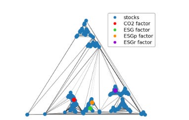
The diagram below shows the graph obtained from applying the TMFG algorithm.
The blue dots represent individual stocks and each of the colored dots below represent the factors for the study period (2015-2020):
Recall that there is a second step to this, which is applying the node2vec algorithm to transform the graph to a 2D space.
The diagram below is the 2D map of the learned embedded space, after applying the node2vec algorithm.

The different sectors are clearly separated and that the CO2 factor is in the center of the Utility sector, which is unsurprising given that this sector is highly carbon intensive.
For the other three ESG factors (ESG, ESGp and ESGr), they seem close to the Health Care and Financials sectors.
Expanding this analysis through the different time windows across the authors’ study (2015-2020), we see the following 2D map:

Looking at the results above, we see that in general, the CO2 factor is consistently located near the Utility sector, while the other three ESG factors tend to move around.
Using the results from these maps, the authors then construct these portfolios:
Far portfolio: Equal-weighting the 30 furthest firms to a given factor
Close portfolio: Equal-weighting the 30 closest firms to a given factor
Far - Close portfolio: Long (buy) the 15 furthest firms to a given factor and short (sell) the 15 closest firms to a given factor. Also equal-weighting. This is probably the closest representation of a hedging portfolio
Data and Results
The stocks in the authors’ universe are from the Russell 3000 and the S&P 500 Index to construct the four factors above.
For the construction of the far, close and far-close portfolios, they only select stocks that are part of the S&P 500 Index throughout 2015 to 2020 — a period coinciding with the start of the Paris Agreement adoption to the US withdrawal.
Here is the summary of the data from the 470 stocks qualifying for selection:

From the summary table, it is indicative of how skewed the carbon emissions data is, especially for sectors such as Utilities, Energy and Materials.
Perhaps it is therefore unsurprising that the Co2 factor is located so close to the Utility sector in the charts above.
So, how did the portfolios perform?
The summary table below shows the portfolios built in relation to the CO2 risk factor:

One statistic that stood out from the table above is that the far-close portfolio has the lowest risk metric, measured in terms of both maximum drawdown (MDD) and value at risk.
In the authors’ words, the portfolio “is an efficient hedging opportunity which provides a negative exposure to CO2 while ensuring low correlation with market risk.”
Given the title of this post, this is perhaps not surprising. Building a long-short portfolio using the graph method may be a good way to hedge against carbon risk.
Meanwhile, the far portolio (buying 30 stocks furthest away from the CO2 factor) seems to outperform the market (S&P portfolio) over the 2015-2020 period, although we probably should not immediately conclude that there is a green alpha, but rather it simply could be a period where utility names underperformed.
The authors also replicated the above with the three other factors: ESG scores, promised ESG scores (ESGp) and realized ESG scores (ESGr). Unfortunately, the far-close portfolios do not exhibit the same risk-reducing characteristic that we saw for the CO2 factor.
This finding is consistent with some other papers that seem to show that carbon emissions data has the highest correlation with environmental risk, but ESG scores in general tend to be more like noise rather than signals.
Summary
I hope you have learned a thing or two from this paper. I certainly have as it is really quite a novel and inspired method to apply a network approach in building a hedged portfolio.
The conclusion also seems to support claims that we saw in other ESG papers, where carbon data seems to be more meaningful and have a bigger impact than ESG scores.
As usual, all credits and images are attributed to the authors of the paper. If you are interested to read more, the link to the paper is here.
Fantastic reference ! Working on something similar myself at work - so will refer to this paper as well. Another clear data point in a series of them that proves ESG Risk ≠ Impact or in this case Carbon performance